Design Basics Start Here
Practice layout, color, typography, image placement, and export checks through simple graphic design exercises built for clear first steps.
LAYOUT
Arrange text, images, and shapes on the canvas with clearer margins, spacing, alignment, and visual
order.
TYPOGRAPHY
Work with headlines, body text, font pairing, and type scale so simple designs stay readable and
balanced.
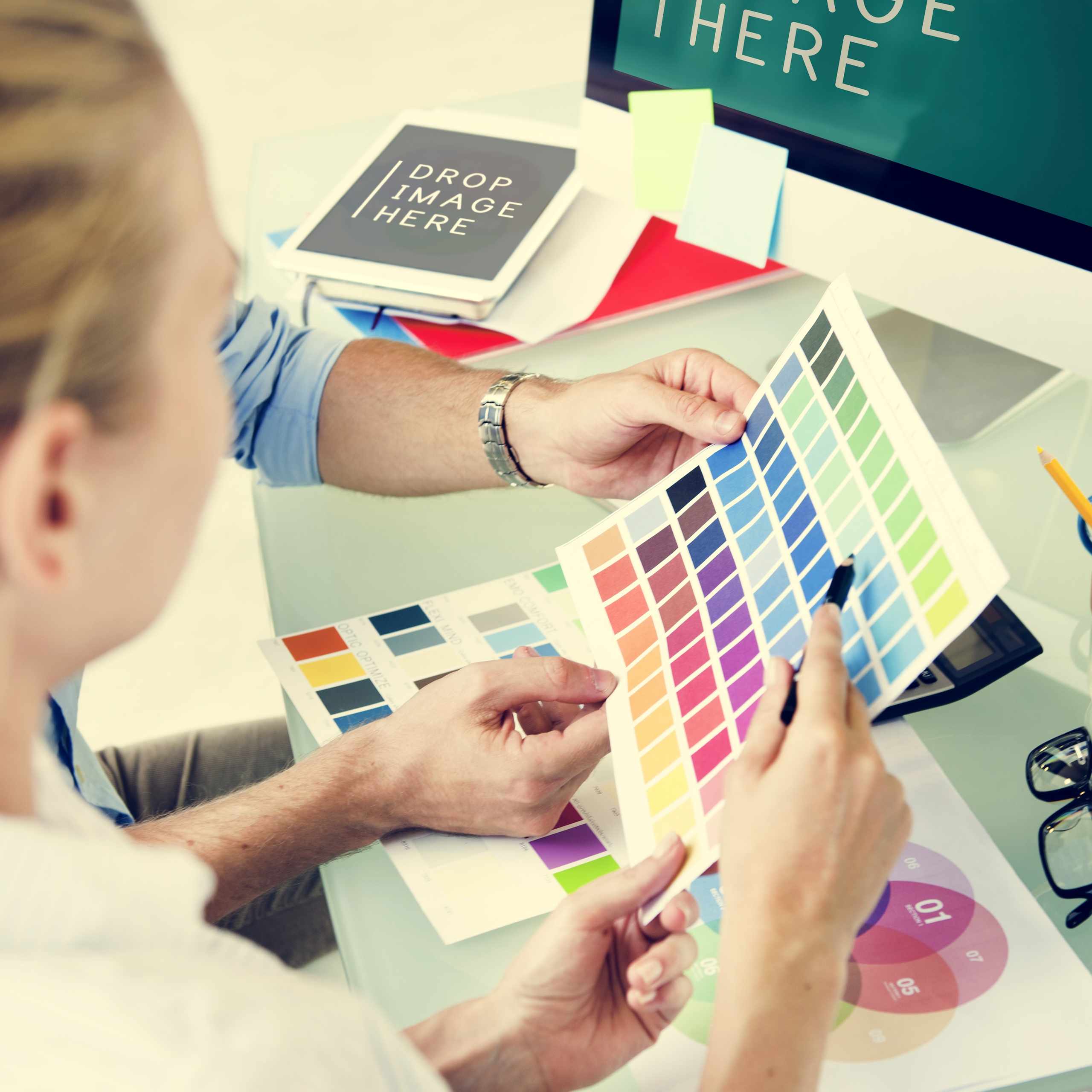
COLOR
Build small palettes, test contrast, and use accent colors without making the design feel crowded or noisy.
IMAGE CROP
Place photos and raster images with a clear focal point so each visual supports the message instead of distracting from it.
GRID CHECKS
Use guides, grids, margins, and padding to keep banners, posters, slides, and social posts from feeling scattered.
EXPORT
Review file size, format, readability, and canvas dimensions before saving graphics for digital use or presentation.
PRACTICE PROJECTS
Use small design tasks to practice one decision at a time.

SOCIAL POST

POSTER LAYOUT

BANNER DESIGN

SLIDE GRAPHIC
EXPORT CHECK
HOW PRACTICE WORKS
The course keeps attention on visible design choices instead of vague creativity talk.

Canvas Setup
Set the size, margins, grid, and rough
content order before adding decoration or
effects.
Design Revision
Compare versions by checking hierarchy, spacing, contrast, and whether the message stays clear.

Tool Awareness
Use design software for guides, type, color, images, and export settings without making tools the whole focus.
WHAT LEARNERS NOTICE
Practical feedback from learners working through layout, type, color, and spacing.
The spacing checks helped me see why my posters felt crowded. I started fixing margins and hierarchy before changing colors.

Rikuto Kunisaki
I used to add too many fonts. The exercises made font pairing and readable body text much easier to judge.